How to read this, in sixty seconds.
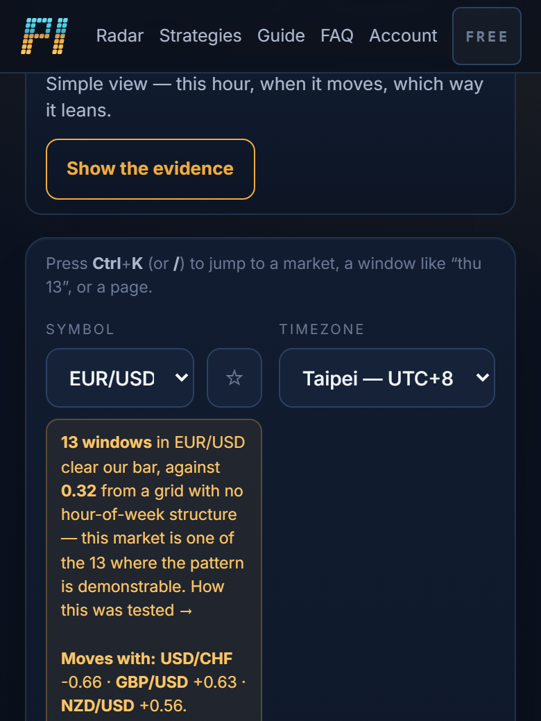
Perfect Indicators shows what a market has done in each hour of the week over the last 23 years — how far it usually moves, and which way it leans. Three things to look at, in this order.
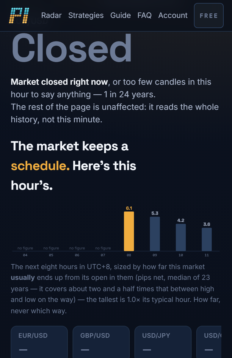
When it moves
The strip under the big number is the next eight hours in your clock, each bar sized by how far this market usually travels in it. Taller bar, busier hour. This is the sturdiest thing on the site — it held up when we tested it on years it had never seen.
Which way it leans, and how sure we are
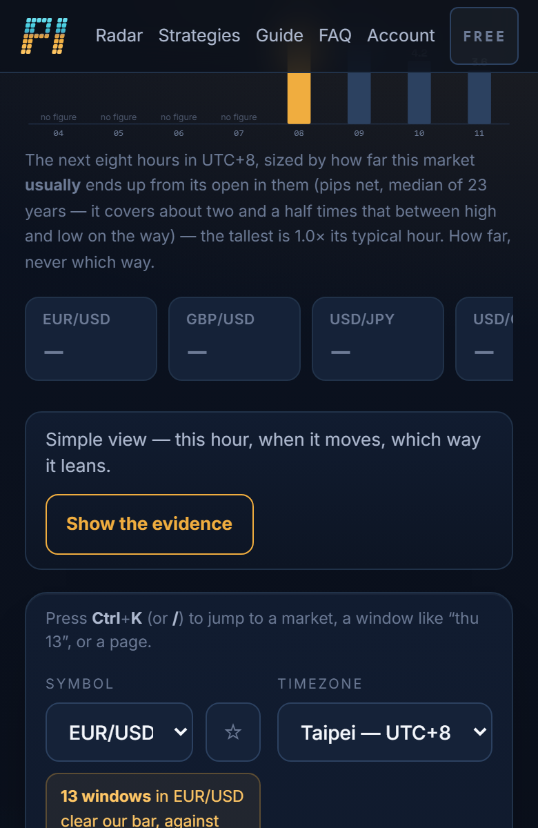
The big number is how often this hour closed up in the past. Solid lean means enough weeks agreed that luck is unlikely; could be luck means exactly that. This is the weaker half of what we know, and we say so on every screen.
The evidence is one tap away
Everything else — intervals, tests, the years where a pattern held and the years where it did not — is behind Show the evidence. Nothing is hidden from you. It is just not in your way until you ask.